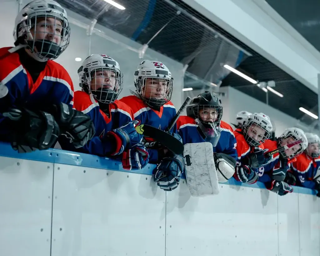
The Evolution of Canucks Jerseys, Logos & Team Identity
For any franchise in the National Hockey League, the visual identity etched onto a jersey is far more than mere fabric and thread. It is a banner for the community, a symbol of eras past and present, and a canvas upon which a team’s story is told. For the Vancouver Canucks, this story is uniquely complex and passionately debated. From their inception as an expansion team to their current status as a modern NHL Pacific Division contender, the Canucks’ journey through logos, colors, and uniform designs reflects a continuous search for an iconic identity. This evolution is not just about aesthetic preference; it is a tangible record of the franchise's aspirations, its connection to the Pacific Northwest, and its enduring quest for the ultimate prize in the Stanley Cup Playoffs. Understanding this sartorial history is to understand the very soul of the Vancouver Canucks.
The Expansion Era: Establishing a Foundation (1970-1977)
The Vancouver Canucks took to the ice for their inaugural 1970-71 season wearing what would become one of the most nostalgically revered designs in franchise history. The original logo, a simple yet distinctive rink-shaped emblem containing a hockey stick forming a “V” for Vancouver, was set against a color scheme of royal blue, Kelly green, and white. This palette was a direct nod to the natural landscape of British Columbia—the blue of the ocean and sky, the green of the forests. The jerseys themselves were clean, with bold striping on the sleeves and waist.
This era’s sweater, often referred to as the “stick-in-rink” or “original blue and green,” represents the pure, hopeful beginnings of the franchise. It was worn by early stars and defined the team’s first chapter in the league. While the team’s on-ice success was limited in these formative years, this jersey forged a deep, lasting connection with the fanbase. Its timeless, sport-centric design has ensured its place as a classic, frequently brought back as a beloved alternate and heritage uniform, serving as a direct link to the franchise's roots detailed in our Vancouver Canucks origin story.
The "Flying V" & "Yellow Skate": A Bold Departure (1978-1996)
In a dramatic shift, the Canucks unveiled a radical new identity for the 1978-79 season. The serene blues and greens were replaced with striking yellow, orange, red, and black. This period is defined by two distinct, and often polarizing, jersey designs.
First came the infamous “Flying V.” The jersey featured a large, yellow “V” pattern emanating from the waist to the shoulders, with contrasting black and red sleeves. The logo was a modernized, stylized “C” that also incorporated a hockey stick. While undoubtedly bold and memorable, the design was widely criticized and has frequently been ranked among the most unusual in NHL history. Nevertheless, it has since been embraced for its audacity and unique place in hockey lore.
In 1985, the team introduced the “Yellow Skate” or “Flying Skate” logo. This era saw the primary color shift to a vibrant red, black, yellow, and white scheme. The logo was a stylized skate blade forming a “C” with a hockey stick, set against a speeding puck trail. These jerseys, particularly the iconic black alternates, are associated with the franchise’s first golden age of on-ice success. They were worn by the legendary 1982 team that made a surprise run to the Stanley Cup Final and adorned the backs of stars like Pavel Bure, Trevor Linden, and Kirk McLean during the electrifying 1994 Stanley Cup run. The intensity of the colors and the aggressive logo mirrored the thrilling, high-octane style of those playoff teams, memories forever etched in franchise history as explored in our look back at key playoff moments.
The Orca Bay Era: A Modern Rebrand (1997-2006)
A new chapter began in 1997, coinciding with the franchise’s purchase by Orca Bay Sports & Entertainment and its move from the Pacific Coliseum to the new General Motors Place (now Rogers Arena). The rebrand was comprehensive, introducing a navy blue, maroon, silver, and white color scheme. The primary logo became a stylized orca whale breaking through a circular shape, which also cleverly formed a “C” for Canucks. This design was a deliberate move to establish a modern, marketable, and regionally significant identity. The orca is a powerful symbol of the Pacific Northwest coast, and the design conveyed strength and momentum.
The jerseys of this era were sleek, with contrasting shoulder yokes and a new wordmark. While the connection to corporate ownership (Orca Bay) was noted by critics, the logo successfully embedded the team within the regional iconography. This uniform set the stage for the West Coast Express era, worn by stars like Markus Näslund, Todd Bertuzzi, and Brendan Morrison as the Vancouver Canucks re-established themselves as a perennial playoff team and Pacific Division powerhouse.
The "Johnny Canuck" & Refinement (2007-2019)
Responding to fan sentiment and the NHL’s league-wide switch to Reebok Edge uniform technology in 2007, the Canucks underwent another significant change. The color scheme evolved to a dominant navy blue, green, and white, a conscious effort to reconnect with the franchise’s original colors while retaining the modern orca logo. The green was a welcome return for many fans.
This period also saw the rise of the “Johnny Canuck” logo as a prominent secondary mark. Depicting a stylized lumberjack, this figure drawn from Canadian folklore had been a part of the team’s visual history for decades. His increased prominence on third jerseys and shoulder patches represented a nod to tradition and a more overtly “Canadian” identity. The 2010s featured several uniform iterations, including a highly popular “Millionaires” throwback honoring Vancouver’s early hockey history, and a green “Johnny Canuck” alternate that became a fan favorite at Rogers Arena. These designs reflected a franchise maturing and exploring the depth of its own heritage.
The Current Era: A Harmonious Synthesis (2020-Present)
The current uniform set, introduced for the 2020-21 season, represents the most refined and harmonious synthesis in franchise history. After extensive fan consultation, the Vancouver Canucks returned to their original 1970 colors of “Pacific” blue and “Forest” green as the primary palette, with white and silver as accents. The primary logo remains the orca, but it has been simplified and now appears in a single color (white or blue) against the vibrant jersey base.
This design successfully bridges the franchise’s entire timeline. It honors the foundational colors of the stick-in-rink era, retains the modern orca symbol that has represented the team for over 25 years, and executes it with a clean, contemporary aesthetic. Worn by the new core of Elias Pettersson, Quinn Hughes, and Thatcher Demko, and under the guidance of Head Coach Rick Tocchet and General Manager Patrik Allvin, these jerseys symbolize a fresh, competitive era. They are a unifying symbol for a fanbase looking toward a future where the ultimate goal, a Stanley Cup championship, is pursued in colors that proudly reflect the team’s home from its very beginning.
Iconic Jerseys in Memorable Moments
A jersey becomes legendary when it is associated with historic achievement. For the Canucks, several uniforms are forever linked to iconic moments:
1994 Stanley Cup Final Run: The black “Flying Skate” jersey is inseparable from the image of Kirk McLean’s epic save in Game 7 against Calgary, Pavel Bure’s breakaway goals, and the heartbreaking Game 7 loss in New York. It is the uniform of the franchise’s first true national coming-out party. 2011 Stanley Cup Final Run: The blue “orca” jersey, with its green accents, was worn during the Presidents’ Trophy-winning season and the thrilling run to Game 7 of the Final. It is associated with the artistry of the Sedin twins, the intensity of Ryan Kesler, and the electric atmosphere in Rogers Arena. Heritage Classics & Outdoor Games: The team’s participation in outdoor games has featured special uniforms, most notably the 2014 Heritage Classic “V” jersey—a direct and popular homage to the 1970s stick-in-rink design, connecting generations of fans under the open sky.
Practical Guide for Fans: Identifying Vintage Jerseys
For collectors and fans appreciating jersey history, here are key identifiers for major eras:
1970-77 (Original): Look for the clear “stick-in-rink” logo on the chest. Colors are royal blue and Kelly green. No player names on back initially. 1978-84 (Flying V): The large, yellow “V” pattern on the front is unmistakable. The collar is typically a contrasting color (black or red). 1985-96 (Flying Skate): Identify the colorful skate logo. The home jersey was primarily red (1985-89) before switching to primarily black (1989-96). The black “skate” jersey often has a lace-up collar in later years. 1997-2006 (Early Orca): Features the detailed, multi-colored orca logo. Colors are navy blue, maroon, and silver. The jersey template has distinctive “yoked” shoulders. 2007-19 (Modern Orca/Johnny Canuck): The orca logo is streamlined, often in single-color application. Look for the return of green as a primary accent color. “Johnny Canuck” appears on alternate jerseys.
Conclusion: More Than a Uniform
The evolution of the Vancouver Canucks jersey is a narrative of ambition, regional pride, and the eternal search for a symbol that resonates. From the classic simplicity of the stick-in-rink to the audacious Flying V, from the powerful Orca to the triumphant return to blue and green, each design marks an era and stirs emotion within the fanbase. These sweaters are worn not only by legends of the past but by today’s leaders like J.T. Miller and Captain Hughes, carrying the hopes of a city and a region into each game at Rogers Arena.
This visual history is a core part of the franchise’s culture, a topic endlessly analyzed on forums and fan sites like Canucks Army. It reminds us that a team’s identity is a living, breathing entity, adapting and growing with time. As the Vancouver Canucks continue to build their future, they do so clad in a uniform that finally weaves together the threads of their entire past—a perfect representation of a team and its community, forever striving for greatness.
To delve deeper into the stories of the players who wore these iconic jerseys and the franchise's broader journey, explore our comprehensive section on Canucks history and legends.
Reader Comments (2)