The jersey of the Vancouver Canucks is more than mere sportswear; it is a canvas upon which the franchise's history, identity, and aspirations have been painted for over five decades. From the bold stripes of the inaugural uniform to the sleek modern design worn by today's stars, each iteration tells a story of an era, a player, or a collective hope. For fans, understanding this evolution is to understand the soul of the team itself. This guide provides a comprehensive journey through the visual lineage of the Vancouver Canucks, exploring the iconic logos, the revered retired numbers hanging in the rafters of Rogers Arena, and the symbolism that connects generations of supporters. As the current core, led by Elias Pettersson, Quinn Hughes, and Thatcher Demko, writes its own chapter, the legacy embedded in the fabric of the jersey serves as both foundation and inspiration.
The Evolution of a Brand: A Timeline of Canucks Logos & Jerseys
The visual identity of the Vancouver Canucks has undergone several significant transformations, each reflecting broader trends in design and the franchise's search for a lasting emblem.
The Inaugural Era: The Stick-in-Rink (1970-1978)
Upon entering the National Hockey League in 1970, the Canucks adopted a classic, clean logo: the blue-and-green "Stick-in-Rink." This symbol, featuring a hockey stick forming the letter "C" within a rink-shaped outline, was a straightforward representation of the sport. The accompanying jerseys were equally traditional, with bold green, blue, and white horizontal stripes. While sometimes considered conservative, this look has enjoyed a major resurgence in popularity as a beloved throwback, symbolizing the franchise's humble beginnings.The Flying V & Yellow Era (1978-1985)
In a dramatic departure, the team introduced one of the most controversial and now iconic designs in NHL history: the "Flying V." The jersey itself was a striking yellow, orange, and black "V" pattern cascading from the shoulders. The logo was a modern, stylized "V" with a puck embedded in its apex. Though ridiculed by some at the time, it has since become a cult classic, representing a bold, if unsuccessful, period on the ice. Its uniqueness is now celebrated as a quintessential piece of hockey nostalgia.The Skate Logo Era (1985-1997)
Marking another radical shift, the Canucks unveiled the aggressive "Skate" or "Flying Skate" logo—a crimson, yellow, black, and white stylized skate forming a "C." The jerseys were primarily black, red, and yellow, a stark contrast to the original palette. This era coincided with the team's first period of sustained success, including the 1994 Stanley Cup Playoffs run. For many fans, this logo is synonymous with the passion and grit of players like Pavel Bure and Trevor Linden, making it a perennial favorite for retro nights.The Orca Bay Transition & Current Orca (1997-Present)
In 1997, following the purchase of the franchise by Orca Bay Sports & Entertainment, a new logo was introduced: the iconic blue, green, and silver orca whale. Initially, the orca was depicted breaking through a circle, but it was streamlined to its current form in 2007. This logo, while initially met with mixed reactions for its corporate origins (the orca is a nod to Orca Bay), has now become the definitive modern identity of the team. The current jerseys, with "VANCOUVER" arched above the orca, project a sleek, Pacific Northwest aesthetic that has grown to be deeply respected.Immortalized in the Rafters: The Canucks' Retired Numbers
Retiring a jersey number is the highest honor a franchise can bestow, preserving the legacy of players who have made an indelible impact. In Rogers Arena, these numbers serve as a constant reminder of excellence and dedication.
#12 Stan Smyl: "The Steamer"
Stan Smyl, the original heart-and-soul captain, was the first player to have his number retired by the Canucks in 1991. Playing his entire 13-year career in Vancouver, his relentless work ethic and leadership set the standard for all who followed. His #12 symbolizes the unwavering grit and loyalty that define the franchise's best qualities.#16 Trevor Linden: Captain Canuck
Perhaps the most revered figure in team history, Trevor Linden's #16 was raised to the rafters in 2008. His heroic performance in the 1994 Stanley Cup Playoffs, his leadership through two decades, and his profound connection with the community transcend statistics. Linden embodied the spirit of the Vancouver Canucks, making his number sacred.#19 Markus Näslund: "Nazzy"
The offensive brilliance of Markus Näslund, captain during the high-flying West Coast Express era, led to his #19 being retired in 2010. As a three-time NHL All-Star and Lester B. Pearson Award winner, Näslund redefined scoring in Vancouver and brought a new level of star power to the franchise.#22 Daniel Sedin & #33 Henrik Sedin: Eternal Twins
In a unique and fitting tribute, the Canucks retired the numbers of twin legends Daniel Sedin (#22) and Henrik Sedin (#33) in February 2020. Their careers, defined by otherworldly chemistry, artistry, and leadership, culminated in Hart and Art Ross Trophies and a 2011 trip to the Stanley Cup Final. Their numbers, retired together, represent the pinnacle of skill, consistency, and class in franchise history.#37 Rick Rypien & #28 Luc Bourdon: Honored Memories
The Canucks also honor the memories of Rick Rypien (#37) and Luc Bourdon (#28). While not officially retired, these numbers are out of circulation to respect their tragic, premature passings. This gesture underscores that a player's legacy is measured not only by on-ice achievements but also by their character and the mark they leave on the team family.The Modern Kit: Connecting Legacy to the Present
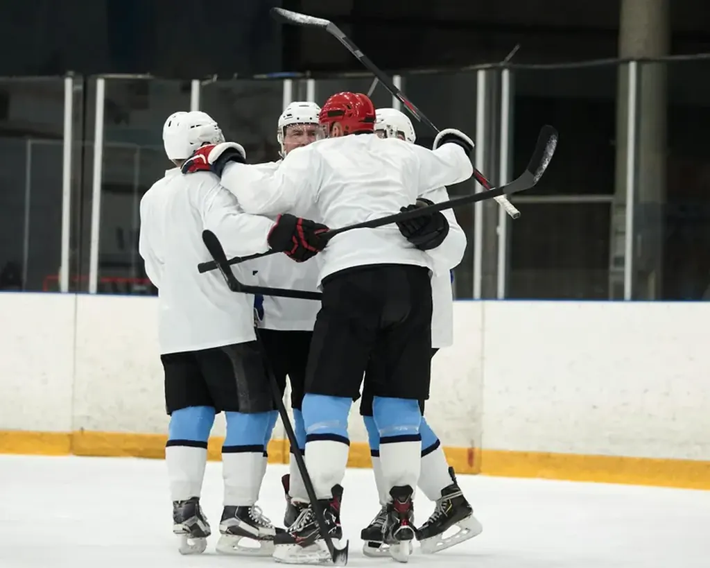
Today's jersey is a direct link between the franchise's rich history and its promising future. The current home and road uniforms, anchored by the Orca logo, are worn by a new generation tasked with upholding the standard set by those in the rafters.
Captain Quinn Hughes dons the "C" on a jersey that carries the weight of Sedins' legacy, while Elias Pettersson (EP40) and J.T. Miller provide the offensive firepower reminiscent of Näslov's era. In goal, Thatcher Demko stands as the last line of defense, embodying the resilience of past heroes. Under the guidance of Head Coach Rick Tocchet and the roster construction of General Manager Patrik Allvin, this group aims to infuse the modern crest with new, championship-level meaning. The jersey's evolution continues with each shift, each game, and each push for the postseason.
Practical Guide for Fans: Identifying Jerseys & Logos
For collectors and new fans navigating the team's sartorial history, here is a quick reference:
Era Identification: Look for the primary logo. The Stick-in-Rink signifies the 70s or a modern retro. The bold Flying V is unmistakably late 70s/early 80s. The colorful Skate logo defines the late 80s to mid-90s. The Orca marks the modern era from 1997 onward. Retired Number Jerseys: When seeking a legacy jersey, the most popular choices are #16 (Linden), #22/33 (Sedins), and #19 (Näslund). Authentic "throwback" jerseys from the Skate era are particularly sought after. Modern Stars: For current players, the jerseys of Hughes, Pettersson, and Demko are the most prevalent, representing the core of the team's present and future. You can follow their ongoing contributions through our regular Canucks news updates. Specialty Jerseys: Pay attention to the team's annual specialty jerseys (e.g., Heritage Classics, Reverse Retros). These often pay direct homage to past designs, like the recent reintroductions of the black Skate jersey or the classic Stick-in-Rink white uniform.
Conclusion: A Living Legacy
The history of the Vancouver Canucks jersey is a tapestry woven with threads of bold experimentation, enduring tradition, profound respect, and unfulfilled dreams. From the classic Stick-in-Rink to the formidable Orca, each logo marks an epoch. The retired numbers are not just fabric; they are immortalized values—leadership, passion, skill, and heart. As the current squad battles in the NHL Pacific Division, they carry this visual and symbolic legacy on their shoulders every night at Rogers Arena.
The story is far from complete. With a talented core and strategic leadership, the next great chapter—and perhaps the ultimate addition to the jersey's lore—awaits. The journey of this franchise is continuously analyzed, from the front office moves by GM Allvin to the on-ice systems of Coach Tocchet, and is passionately debated by fans and on independent coverage sites like Canucks Army.
Explore more about the architects of the current team's style, including an in-depth look at the leadership of Captain Quinn Hughes. The legacy continues, stitch by stitch, game by game.
Reader Comments (4)